Let's Rummage

Showing posts with label sketch. Show all posts

Saturday, 8 August 2015

iPad Sketch

I did this sketch on an iPad Air using a 53 Pencil and the Concept drawing app.

Marie reading her book in the sunshine somewhere isn Sussex.


Friday, 12 December 2014

Bear With Me a Second

Another bear sketch.

Mess with me, y'mess with m'bear!

Wanna Rumble?

Thursday, 11 December 2014

Just Bear, With Me

Last Friday was the last session of this year at the Putney School of Art and Design Illustration class. One or two people were collecting contact information and a couple of my classmates were enthusing about Facebook. I sent them an email a few days ago asking them to sell the benefits to me, as they both had sensible shoes on the subject.

I received a reply from one of them last night to say she hadn't forgotten about this but was up against the Dead Lions so "bear with me" - adding a comment about the oddness of that phrase, and perhaps there's a sign in there.

That's all the prompting I needed and a maelstrom of ideas swirled around my head - or was that just the wind in the poplars.

Good title for a book Awa Rich!

Here's a preliminary sketch - thanks for the nudge Sharon http://creativefoxblog.blogspot.co.uk

Just Bear, With Me

Friday, 14 November 2014

Old Thrubby - Gone Native

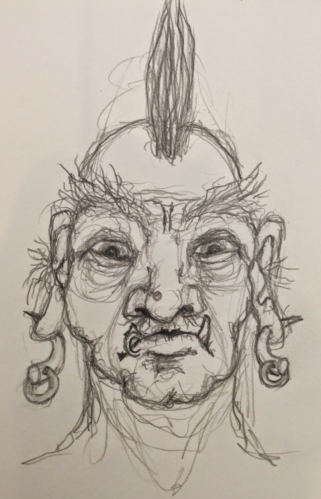
In this morning's illustration class at Putney School of Art and Design, Olivia was showing the dummy for her new book. It has a monster in it. A very nice monster.

Inspired by Olivia's monster

There's another book title Awa Rich!

and thinking about one of the characters in The Collaborative Project, I drew this during the show and tell session.


Will you stop leaving all these scary characters lying around Awa Rich. It's alright for you, I have to live here!

Friday, 18 July 2014

Get knotted

I was reading in The Book of The Book of Kells the other day what tools the monks would have used to create the designs. It was all simple stuff, compasses, straight edges, French curves, quill pens, brushes and pointed sticks.

All the designs I've drawn so far have all been free hand. So I decided to have a go at a more accurate drawing. I don't have George Bain's book (note to self: must get hold of a copy) so I had to work it out from scratch.

And there was much scratching Awa Rich, you musv rubbed that rubber away.

It took me most of the day trying things out and scratching my head, making adjustments or starting again. This is the result, though it might be a schematic for part of the Large Hadron Collider.


These are the sketches I did earlier. You can see the scrap of paper I drew them on in the photo above.


I photographed them with the iPad, cropped them and then opened them in the Autodesk Sketchbook Pro app.

The small sketches are units for a larger design so I duplicated the layer containing the unit, rotated and moved each layer and filled in the gaps on a new layer to make the design below. It's a bit messy but it was only a proof of concept.

You'll soon be fluent in WaffleSpeak and BizzyBabble if you keep this up Awa Rich.


That seemed to work, so I did a slightly neater version.


I noticed that if I overlapped the points of the heart/pretzel shaped part I could interlock the whole design.


And here's the same thing using the design drawn with instruments.

(I seem to have acquired another keyboard dyslexia tick, there is no h in desighn as there is no u in Yourkshire).

No there int Awa Rich, you vact your wayt out of there to London.


Stay tuned for the finished version. That'll take me another couple of days. No wonder it took so long to create The Book of Kells.

By the way. Last night, while Marie was out with her office comrades at a swanky restaurant, I watched The Secret of Kells again - a brilliant animated story about the origin of The Book (that turns darkness into light!)

It's a dramatisation of the known facts and a ripping yarn. Watch it for the story, the design, the shapes (you'll see what I mean when you watch it) the illustration, the backgrounds, the music, the characters, the magic, the mythology, the jokes, the cat and the messages both hidden and explicit.

Stay with it as the end titles roll for a wee treat as the late Mick Lally (the voice of Brother Aidan) recites the poem Pangur Bán - in Gaelic, written by an Irish monk in the 9th century about his cat.

Get hold of a copy, it'll restore your faith in 2D animation. Suitable for children of all ages. The wolves and the Vikings are pretty scary though, but all is well in the end.

Tuesday, 15 July 2014

Knot So Fast Buster!

A good place to start telling a story is in the middle. I put this Celtic knot picture in a previous post as an example of a drawing I'd made using the 53 Paper app. on my iPad. It started as a doodle, a warm-up for some other sketches in a proper paper sketchbook, but I reworked it after drawing more of the same with pencils, coloured pencils and watercolour.


Decisions I made while using physical media influencing decisions about the digital image. Using the eraser a lot - much easier in the digital context, though in the 53 Paper app. there is only a hard eraser whereas a real eraser can be more subtle. Real paper can only withstand a certain amount of scrubbing but a digital eraser can rub out as many times as you like.

I like the effect of layering colours you get with coloured pencils, the way you can see the granular texture of the colours in the previous layers. I tried it in the digital image and achieved a fair approximation. A pleasant effect, better than flat colour. Using the pencil tool to draw the thick outlines was useful as I could over draw lines to make them stronger or ease back on others - more like a real pencil and less digital looking than using the pen or marker tool to give a solid line.

Overlaying watercolour glazes creates some interesting effects but nothing like real watercolour.


Here's a page from my sketchbook with the same design drawn with non photo blue pencil - to establish the design - overdrawn with a 0.5 mm mechanical pencil then coloured with Derwent Studio coloured pencils.


The design below has been outlined with black ink.


Finally, a more worked up version done with a combination of watercolour and coloured pencil on Fabriano Accademia Desegno e Acquarello 240 gsm natural grain paper - which is very absorbent for a paper that declares itself suitable for watercolour, though you can achieve some interesting effects once you get used to it.

The absorbency of the paper exaggerates the way watercolours dry lighter than they appear when they're wet. Some colours appear very dark when wet but almost disappear when they dry.


So, how did I get here? I was marvelling at The Book of Kells on my iPad - get it in the AppStore for the price of an average bottle of wine, you'll be enjoying it long after the wine has gone.

You should go into advertising copywriting - back in the '50s Awa Rich!

I was wondering where you'd got to.

Same here Awa Rich. I was beginning to think you'd abandoned me.

I've been fascinated by Celtic knotwork since I was a kid. My brother Nick and I went through a phase of filling any available piece of paper with intricate designs we called 'creepers' like the tendrils on a pea vine. We'd discovered fractal self similarity, though we didn't know it at the time.

A prize with no bells on it for you Awa Rich!

This made for fertile ground when I got a book about the Vikings from a 'book of the month club'. It had some knotwork design on the cover and/or there were photographs of wood or stone carvings inside. This is all fogged by the passage of time.

That's my version of the story. Nick might remember it differently.

It was Nick that took knotwork as his own thing, beginning with the dust jacket of the Vikings book. The original must have been pretty boring as he replaced it with his own design. From then on, any available surface was fair game. Take a look at his website, there's a link over there on the right.

The design in the image at the top of this post was copied from a small pendant on a troll in a Brian Froud illustration.

All this because I was scratching around some designs for a logo or monogram for my sketchbooks. Actually, a seal to replace the bead on the end of the bookmark ribbon.

Is that the future feature Awa Rich?

One of them, yes.

Monday, 14 July 2014

Messing around with Paper (digital)

I was rummaging around in my drawers - as you do - and came across a pack of Milliput (epoxy putty) and wondered if it was still useable or had it set solid?

Milliput alway reminds me of the sticks of gelignite used by bank robbers in old American black and white gangster movies, I cut a slice from each of the sticks and kneaded them together like a good Peterman (that would be a safe blower Awa Rich) and it was still good. I couldn't resist making a head from the marble sized ball that resulted - having no leaks to fix or cracks to plug.

The face of this creature put me in mind of Pierrot the clown, so I snuffled around on the Googles for some pictures. Seems I'm not the only one who finds all those Comedia del Arte characters a bit creepy. There was a stunning photograph by a young Swedish art student of a doll, but shot so that it looked like a person. Very beautiful but faintly disturbing. Clowns and dolls, guaranteed to give me the collywobbles. It must have been all those black and white Hammer Horror films I watched in the '60s.

That led me on to drawing on my iPad with the 53 Paper app, probably the simplest graphics app available - limitation being the muse of creativity and all that. Drawing on a computer or iPad with a stylus is a lot more difficult than using the real deal - pencil and paper - but, as with everything, practice makes pretty good. Plus, I find that the different experiences of using a computer and physical materials produce inspirational flashes that have me zipping back and forth between the computer and my drawing table to try out what I've just discovered. Try this at home!

Them would be those transferrable skills you used to teach to YTS trainees Awa Rich.

Indeed.

I'd been monkeying about with some very basic Celtic knots - for reasons I'll explain later - but wasn't too happy with the drawing on the iPad, so I had another crack at it and was more satisfied with the result. Drawing on the iPad is a good warm-up exercise.


I was thinking about some little characters for a story I'll tell you about sometime and was leafing through a book of Swedish Folk Tales illustrated by John Bauer (are you listening Brian Froud?) After a few abortive attempts at getting the look I wanted, I erased the page and started on a drawing for the Pierrot character inspired by the strangely beautiful doll photo.


I'll show you the model when it's finished.

Tuesday, 24 June 2014

That should be the title of a book

A little voice in my head says that frequently when I see or hear certain groups of words. So many phrases sound like book titles.

I'm sure that making titles for books is a more arcane form of witchcraft than just thinking a bunch of words sound good or clever, but it's a little thing that keeps me amused.

Are you going to tell us the title of your latest bestseller Awa Rich?

Sketching with Olivia.

This week we went to Merton Abbey Mills as it's easy walking distance and midway between where we both live. It's the site of William Morris's Liberty Print Works. You may have seen Tony Robinson snorkelling in the Wandle  - is that another book title Awa Rich?  - when the Time Team excavated the area looking for any remains of the works, before the site was developed.

We found a shady bench opposite the water mill. Olivia did an A3 (A4 double page spread) in fineliner and watercolour. She was a bit doubtful whether she'd post it on her blog. I thought it was great, bold lines and colours compared with my rather ticklish pencil and wash.

Funny how we're far more critical of our own work than other's. We both sat there telling each other what was wrong with our own sketches whilst praising each other's.

The Water Mill as Merton Abbey Mills

Once again, I used A4 200 gsm cartridge paper, a 3B 2mm mechanical pencil, Rembrandt watercolours (cunningly disguised in a Winscale and Newtron Bijou Box) and a Pentel Waterbrush - though water and spillages were not a problem today.

I hope you didn't use any of those wicked cadmium pigments. T'would devastate the ecosystem Awa Rich.

Nope, just raw Sienna, burnt umber, Prussian blue and alizarin crimson.

Whoa! Now that's what I call a limited palette Awa Rich.

Well, limitations can make you more creative and a big box of colours can encourage you to make mud. I bought a book recently, called Journeynow that's a good title Awa Rich - by Aaron Becker. It's a wordless story about a bored and lonely young girl who draws a doorway into another world.

After looking at it for some time I reckon he used a similar palette, or at least, I could mix the colours in the book from just those four colours. The printers may have cranked up the saturation a bit and the girl's red crayon is probably cadmium red, but it's surprising what you can do with so few colours.

Sunday, 22 June 2014

Sketching at Fulham Palace

On Friday (20th June) the illustration class from Putney School of Art and Design had a PlayAwayAwayDay at Fulham Palace. Bright Phoebus shone most glorious and a good time was had by all.

Find out about Fulham Palace

Fulham Palace is a haven of tranquility and contemplation in the midst of urban London. It's a great place to sketch as there are usually people around - on Friday there were a couple of school groups and a wedding - several interesting buildings and the recently renovated walled garden which is a lovely place to escape from the hullabaloo to read, sketch, eat your lunch or canoodle - as evinced by several couples who found the sunshine and seclusion highly conducive.

I stayed all day and did two sketches, one in the walled garden and one of the facade of the palace.

Ian drawing the greenhouses in the Knot Garden
 Ian is an architect who eschews 'puters and still draws the traditional way. He does fantastic pen and watercolour drawings. I did this sketch on A4 200 gsm cartridge paper with a 3B mechanical pencil and Derwent Studio coloured pencils.

A gaggle of school children in front of Fulham Palace

I did this sketch on A4 200 gsm cartridge paper with a 3B mechanical pencil and  Rembrandt watercolours using a Pentel waterbrush, which is great for sketching as you don't need a pot of water which can spill all over the parquet floor.

When you visit a museum and Uniformed Security Personnel (What's your USP Awa Rich?) search your bag. They're not looking for Weapons of Mass Destruction, they're after your watercolours, as Ian will relate.

I got the proportions a bit askew, the building is wider than it appears here. Another problem I always have with buildings is dividing up the space between the windows and doors. I think I can do it by eye rather than using a perspective division method, but as you can see - I can't.

Linda asked Ian how he gets his drawings to look so accurate, he just shrugged and replied "years and years of practice". The answer no one wants to hear but know deep in their hearts to be true.

Accept no substitutes eh Awa Rich?

True enough. Now go practice!

p.s. I can thoroughly recommend the coffee and the chocolate brownies in The Drawing Room cafe, I went back twice!

Wednesday, 18 June 2014

Sketching with Olivia by the Thames in Richmond

This morning I left the flat in the rain and cold - yes, the Summer Solstice is on Saturday - and caught the train to Richmond. A small group of us (current and former students of Putney School of Art and Design Children's Book Illustration class) get together to sketch the Out There now and again. Sometimes we head into the city, sometimes out.

Two of us couldn't come out to play today, so it was just me and Olivia. After walking upstream to that point where we might keep walking and not do any drawing, we decided to stop walking and sit.

The bench was quite wholesome, not too much moss, lichen, bird poop, ice cream or other unidentifiable unsavouriness. The view was reasonable - river, trees, buildings, boats, people. We sketched for a couple of hours and the sun came out. A pleasant way to spend a morning, drawing what's in front of you and talking of, well you know, those brassicas and monarchs again.

I'm still enjoying using my antique Derwent Studio coloured pencils. Olivia went for pen and watercolour.

Go to Olivia's blog to see her sketch.

Olivia's pen and watercolour sketch of Richmond Bridge

On the Thames at Richmond - click for bigness

Tuesday, 17 June 2014

It's Full of Cats!

Ten thousand years from now - when we've all gone to our accounts impenitent - and Tony Robinson is digging up the internet only to discover it's made entirely from cats - I want the Akashic record to show that I made a small but significant contribution.

The cup of my drafts folder runneth over with incompleteness so here's a bit of silliness to tide you over until the next post.

Oh the bugles played the next post in chorus, and the pipes played the flowers of the forest.

Mr. Foo is my downstairs neighbour's cat. I don't want to know that he's really called Keith or Fankle J. Roosevelt. He sits on the window sill surveying his domain, looking like an old Mandarin.

I didn't utter a word Awa Rich.

I drew him with Derwent Coloursoft pencils.


Tuesday, 10 June 2014

Fairy Thoughts

The week of the second May public holiday (formally known as Whitsun) was a washout - as I mentioned in my last post.

A time for reading, writing, drawing and conversation. Even the residents at the bottom of the garden were taking shelter wherever they could.

I was checking in on Olivia's blog to see what she'd been up to lately. There was a delightful watercolour of a thoughtful fairy, which inspired me to draw a fairy.

OliviaArtbox

I always take a bag full of art materials on these sojourns and spread them out all over the dining table when we arrive. I'm usually disappointed by the amount of creation I've completed by the end of the week. This time I just took a large and a small sketchbook and my ancient Derwent Studio coloured pencils.

It's been ages since I last used coloured pencils but I really enjoyed pfaffing around with them. Layering the colours and creating different textures. You can exercise a lot of control with pencils. Anything from soft and delicate grainy hints to deep saturated glossy colour. It's amazing how limitations and restrictions can increase your creativity.

It was the first drawing of the week and it was a bit weak.

Let Olivia do Olivia picters and Awa Rich do Awa Rich picters Awa Rich!

Agreed, but it got my hand movong and I made marks on paper. I could see there was potential, not just in the texture of the pencil marks but the subject too. Vegetation, Fungi and anything sheltering beneath, raindrops (on noses and whispering kittens, snowcakes in freezers and fingers being bitten... Sorry, couldn't resist that Awa Rich).

Very droll.


The warm humid weather of the previous week had brought forth a profusion of small mushrooms in the grass. Nothing of any culinary interest but excellent places for wee folk to seek respite from the precipitation.


If you think that this critter bears more than a passing resemblance to the blue folk in James Cameron's Avatar, I would point you in the direction of Brian Froud and Alan Lee's book of fairies where you will find several similar looking beings. This book predates Avatar by about 35 years.


If you're too clumsy in your approach to a faerie, it will turn sideways to the sun in an instant, leaving a vestige of its presence, for a few seconds, lingering in the space it occupied.

Very poetic Awa Rich. You just didn't finish it, that's all!

True, but I really enjoyed doing that background. Building up layers of colours, feathering the edges of the tree trunks to make them look out of focus, creating the filigree network of fine branches in the undergrowth.

I am liking these pencils and playing with them has given me some clues for using watercolours better.